I am guessing the middle top one is the sketch they picked to make our well known lovable Puffle. Right now Puffles look like that blue one the arrow is pointing at, but before like 3 years ago it looked like the middle top blue one. As time passes it got more graphics, showing technology improved for Club Penguin.
Wednesday, February 24, 2010
Old Puffle Designs
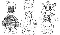
Screenhog showed us a new design sheet of what could have became the Puffle. After seeing this I am glad we have the pet design we have now. I wonder what were going through the creators minds making this...
I am guessing the middle top one is the sketch they picked to make our well known lovable Puffle. Right now Puffles look like that blue one the arrow is pointing at, but before like 3 years ago it looked like the middle top blue one. As time passes it got more graphics, showing technology improved for Club Penguin.
I am guessing the middle top one is the sketch they picked to make our well known lovable Puffle. Right now Puffles look like that blue one the arrow is pointing at, but before like 3 years ago it looked like the middle top blue one. As time passes it got more graphics, showing technology improved for Club Penguin.
Subscribe to:
Post Comments (Atom)


No comments:
Post a Comment